Done with my studio, TOQUE Ltd, this new beer brand is all about bikes. The main inspiration for the logo/icon is how perfectly a bike could be created with that "FG" acronym. From there, the main idea of the cans was in looking at head badges on bikes and developing one that could work for this brand. And with fixed gear bikes being all about being brake-free (other than slamming down your heel), I created this hop bird to emulate that action but be majestic enough that we could get these created as bike head badges. For labels (still a work on progress at this point), going super simple and clean, unquestionably Fixed Gear brewing.
Fixed Gear Brewing Co. (branding & label design)
You may also like
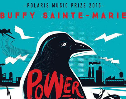
Polaris 2015 - Buffy Sainte-Marie (poster artwork)
2015

In the Pines (editorial and product design art)
2021
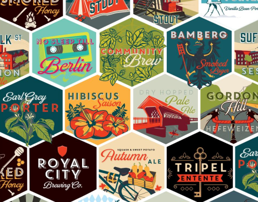
Royal City Brewing (branding & label design)
2017
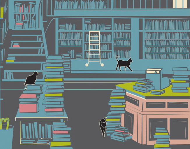
The Goose (editorial comic)
2018
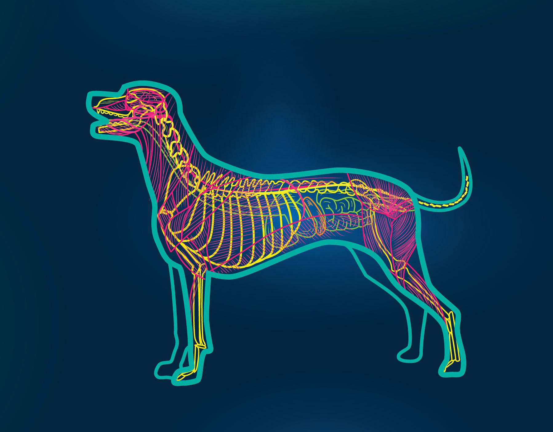
Canine Anatomical Illustration
2019

HotDocs Podcast Festival (event artwork)
2016
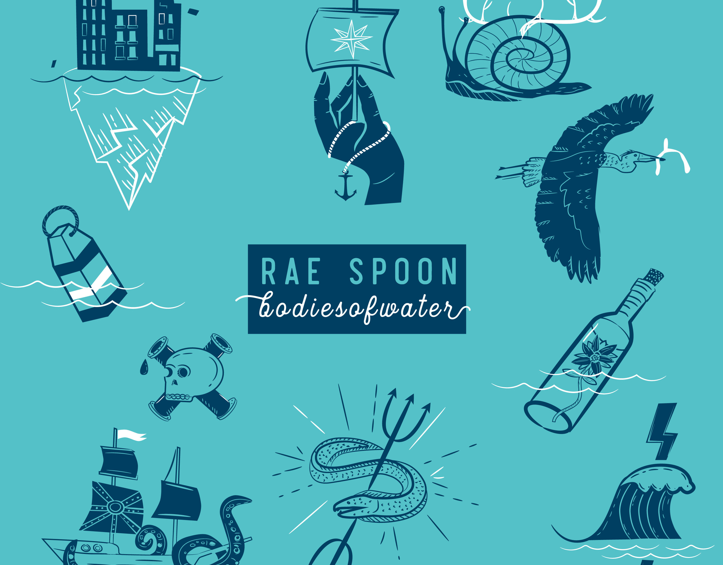
Rae Spoon - bodiesofwater (cd illustration & design)
2018
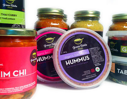
Green Table Foods (branding & packaging design)
2014
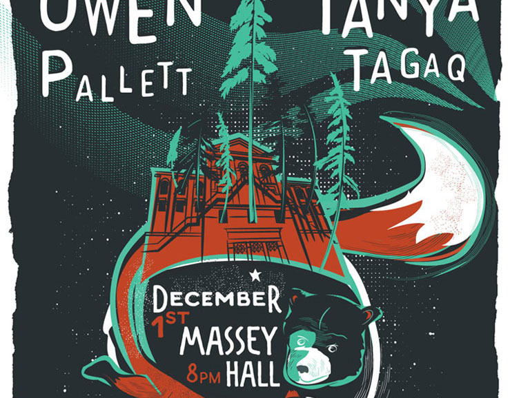
Owen Pallett & Tanya Tagaq (event poster)
2015
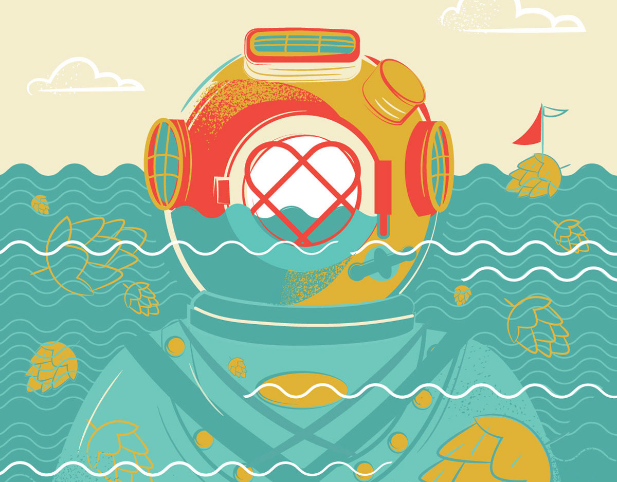
Growler Magazine (cover art)
2018
